
Brand Color on Corrugated Packaging Analysis
By Alexander Greenhalgh, Connor Maskell, Alexander Solomon, Kaitie Spaude; Faculty Advisor: Chris Bondy, Gannett Distinguished Professor
Packaging
Abstract
In order to understand brand color variation in corrugated packaging, samples of seven different consumer brand packages were collected from retailers in 11 locations across the United States. These samples were tagged by location and then organized by brand.
While core brand colors are often utilized across all variety of the brand, frequently these are part of a larger palette of packaging colors: for example the diaper brand Huggies® has one consistent brand color across the different product variations, these product variations are informally known as Stock Keeping Units, or SKUs. After
tagging and organizing, the packages were sorted with the goal of the researchers better understanding what colors were common across all packages, as well as those colors that are used across the majority of the samples received.
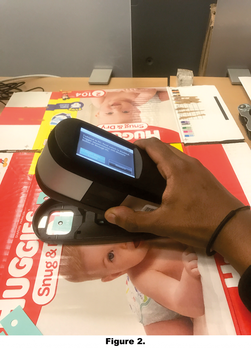
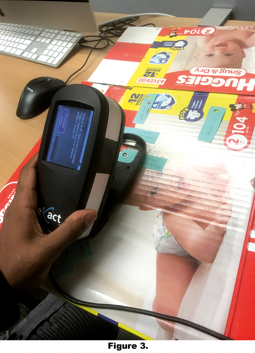
The testing of color variation was performed using an X-Rite eXact™
SpectroDensitometer. All colors measured for each individual package were averaged to create the data point for each measured color on the package. These are compared to a brand standard, when available. If a brand standard were not available, the standard was set as average of all packages.
Procedure
The X-RiteColor® Master software, along with a spectrophotometer, can be used to record spectral and colorimetric data across an array of standards and samples. The software builds a database with the goal of offering quality assurance to color producers. The SpectroDensitomer used for this procedure was the X-Rite eXact™ model which is designed for taking readings for print and packaging industry.
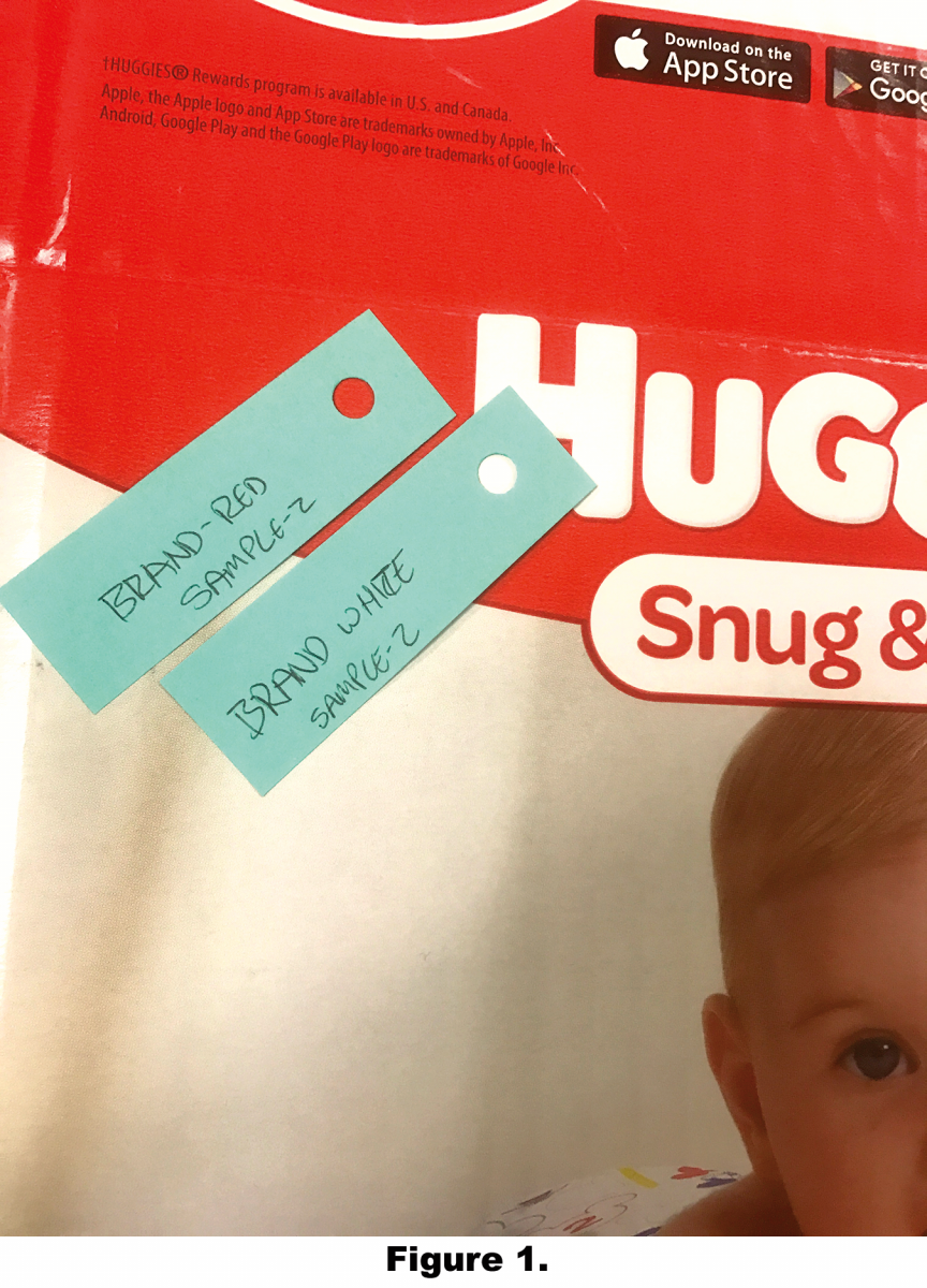
In order to achieve accurate readings, locations were marked on each package using punched adhesive note pages at multiple locations on each package.
Data/Results
To better organize the resultant data, the researchers used different methods to create the respective standards. This was especially challenging as the specific targets are not available in each case. Together with available collected data and available information the standard creation methods were:
Average of all the readings
Pantone® Value was found Other color value was found
The first standard creation method was used for colors that had no
colorimetric standard available. In these instances, the standard was created from an average of all the readings for that specific color for the individual brand. For example, for the red featured on the Arm & Hammer® packaging that were supplied was used for this “average of all samples” standard creation method. After taking all of the readings for this color, the researchers created an average of all the red values that we received and used that as our standard for comparison.
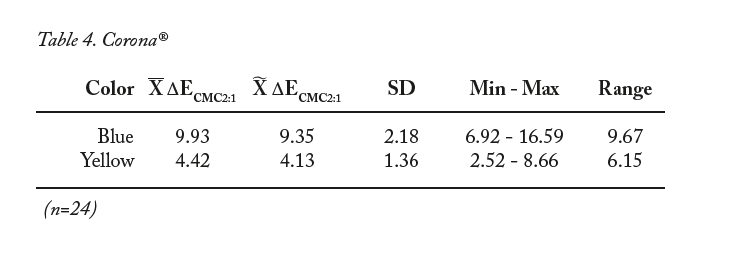
The second standard creation method was for those brands with a known Pantone® value for their colors. Corona® is a brand that readily makes a
Pantone® value available for both its blue and yellow colors that are featured on its packaging. To set this standard, the digital Pantone® Plus color library, as available in the eXactManager™ software, was utilized.
Finally, a conversion technique we used to obtain other standards. In this instance, the research team had obtained colorimetric information but did not identify a specific Pantone® color from the brand information. Using those values in a conversion process within Adobe® Photoshop the closest possible Pantone® value was obtained, which was subsequently used as the standard of comparison for those colors.
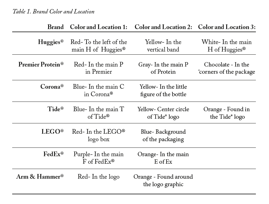
The specific brand colors and locations of the measurements are displayed in Table 1.
Results
Tables 2 through 8 detail the Delta-E values for each color resulted from the measurements. Specifically, Delta-Ecmc with a lightness to chroma ratio of 2:1 (ΔECMC2:1) was utilized by the researchers for the present study.
Analysis
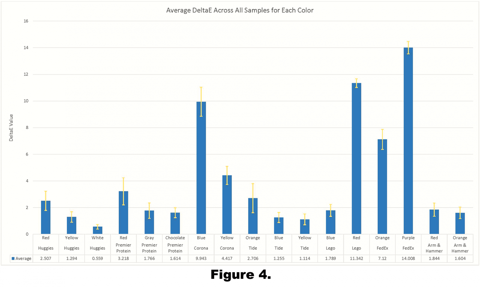
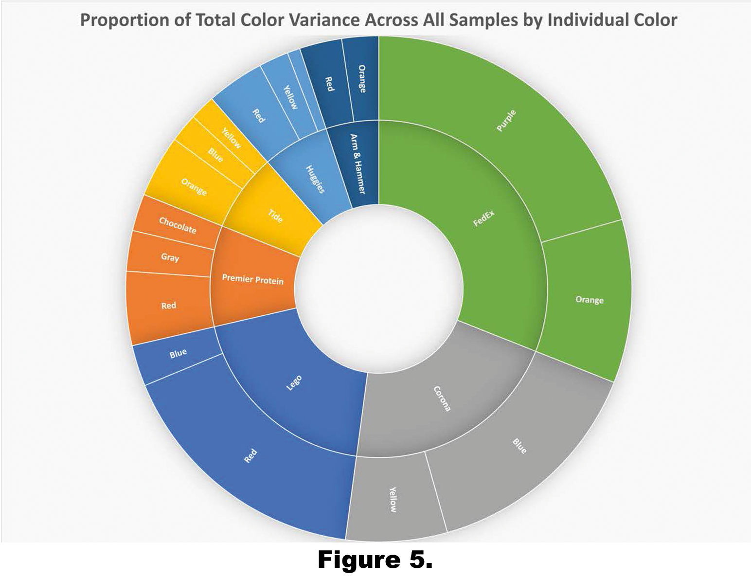
Overall, the combined average Delta-E obtained for all samples was 4.01. As illustrated in Figure 4, the range of Delta-E values is relatively large at 13.45. Due to this large range, factors that may influence the obtained results were further investigated.
For the analysis, the respective colors were separated into groups based upon the three different methods used to establish the respective standards. For colors that did not have a brand standard with which to make the comparisons, the standard was created as the average values of all samples. Colors that did have brand standards to compare measurements to were also grouped together. The only color that was not grouped was “LEGO® Red”, as it was unique by having a converted brand standard with which to make the comparisons. The spectral values used were determined from finding the closest Pantone® color to a hex value as published by LEGO®. This process was accomplished in Adobe® Photoshop CC 2017 in the Adobe® 1998 RGB color profile.
Other identified color groupings are as follows:
Colors Compared to an Average:
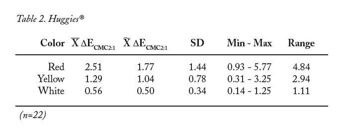
- Huggies® Red
- Huggies® Yellow
- Huggies® White
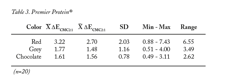
- Premier Protein® Red
- Premier Protein® Gray
- Premier Protein® Chocolate
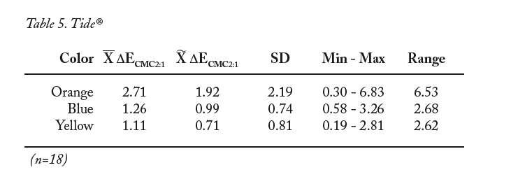
- Tide® Blue
- Tide® Yellow
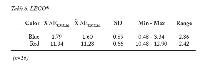
- LEGO® Blue
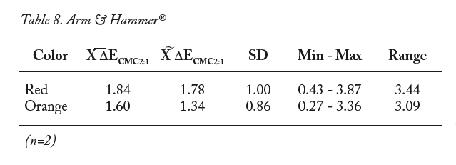
- Arm & Hammer® Red
- Arm & Hammer® Orange
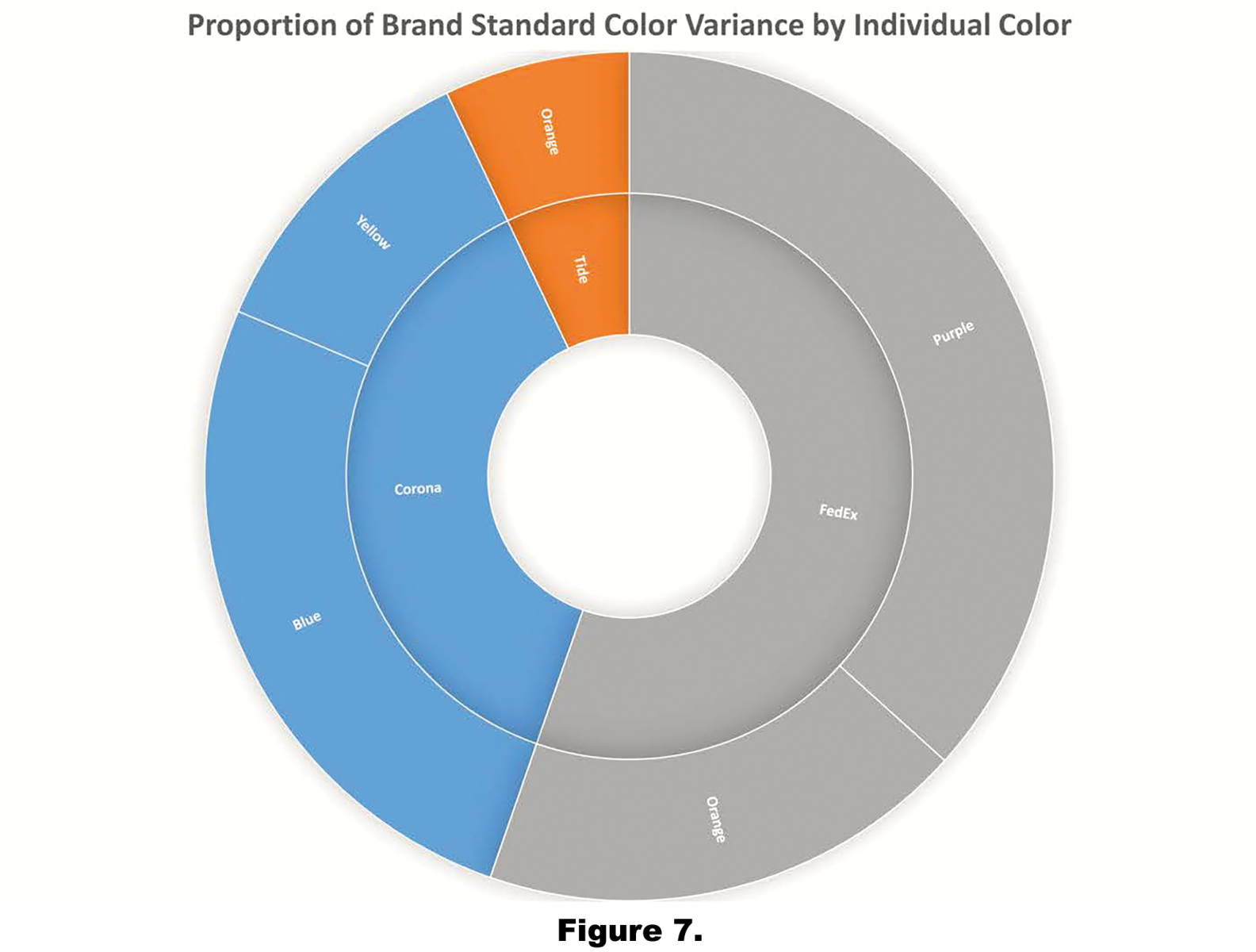
Colors Compared to a Pantone® Color:
- Corona® Blue
- Corona® Yellow
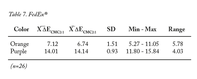
- FedEx® Orange
- FedEx® Purple
- Tide® Orange
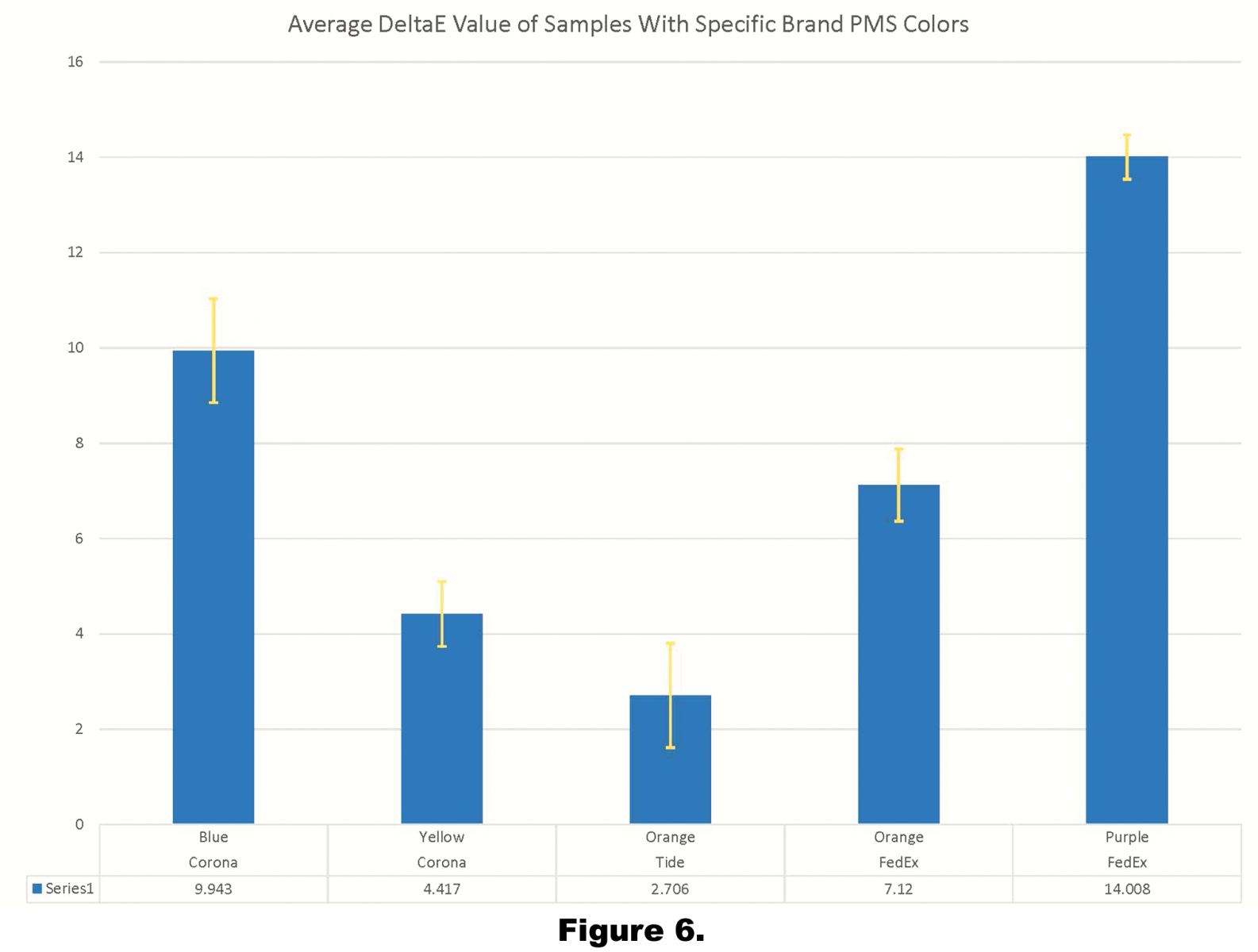
As illustrated in Figure 2, FedEx® and Corona® together represent over half of the total color variance in the entire sample set. They are both in the group of samples that were compared to brand standards.
Figures 3 and 4 display only those colors that were measured against a brand standard. The average Delta-E value for this group is 7.64, with a range of 11.31. The technologies utilized to print the various packaging is of particular note here. For example, in the Corona® sample set of 24 measurements, 16 measurements were taken from packages printed with flexography, four were taken from packages printed with lithography, and four were taken from packages printed with gravure. Of the FedEx® sample set consisting of 26 measurements, 22 were taken from packages printed with flexography, and four were taken from packages printed with gravure.
Of the Tide® sample set of 18 measurements, 14 were taken from packages printed with flexography, and four were taken from packages printed with lithography.
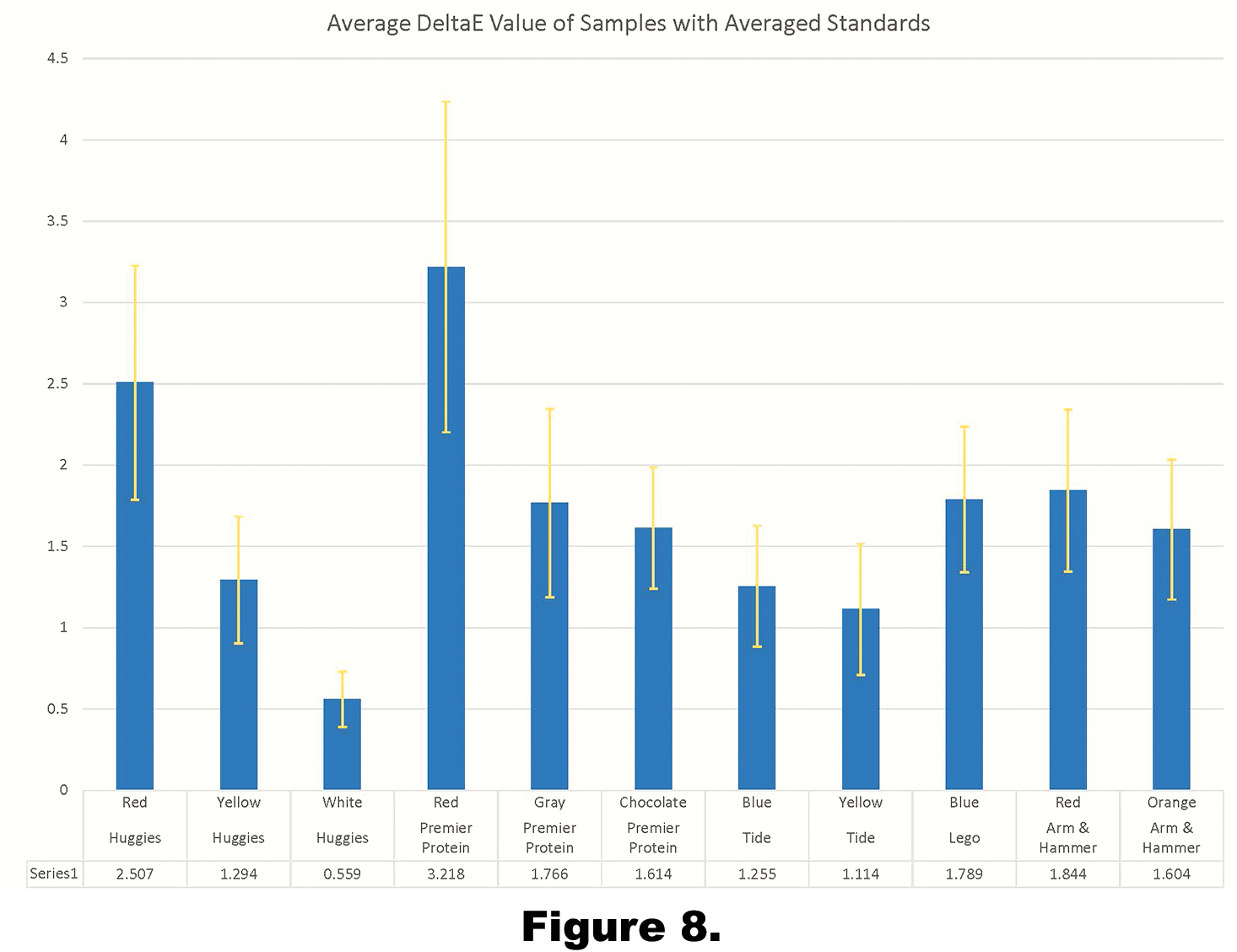
The sample group of colors that were compared to the average of all measurements exhibited a lower average ΔECMC 2:1 than the group of colors compared to a brand specific Pantone® value, as
indicated in Figures 5 and 6. The average ΔECMC 2:1 in this group was 1.69, the range in this group was 2.66. As seen in the graph below, the range is lower than the other group, but the standard deviations are more substantial.
Like the entirety of the samples examined here, there two brands that represented the majority of color variation in this group: Premier Protein® and Huggies®. Premier Protein® red exhibited the highest value in the group, with an average Delta-E of 3.29, and Huggies® red resulted in the second highest value in the group, with an average Delta-E of 2.51. Of the 20 measurements taken on Premier Protein®, the 22 taken on
Huggies®, and the 16 taken on LEGO®, all of the packages were printed with flexography. Of the 22 measurements taken of Arm & Hammer®, ten were taken from packages printed with gravure, six from packages printed with flexography, and six from packages printed with lithography.
Summary / Conclusions and Implications
In order to understand brand color variation in corrugated packaging, samples of seven different brands were collected from retailers in 11 locations across the United States. From the data that were collected from all of the samples, tentative conclusions can be drawn. It is apparent that the average Delta-E that was calculated for each of the samples varies based on how the standard for comparison was created.
Starting with the data that was collected from the process of averaging the data points to create a standard, which resulted in a lower average Delta-E variance compared to the other two groups. The average ΔECMC 2:1 in this group was 1.69, the range in this group was 2.66. It is presumed that a brand manager would likely accept this Delta-E value. It is critical to remember that this color variance reflects the variation of color in packages printed across the country. Even with many of the colors being spot colors, rather than a mix of four-color process, there was still a Delta-E variance of over 2.5. A clear example of this is represented in the data collected from the FedEx® samples. The colors used on the package were all spot colors, yet still the variance of the colors were somewhat high. Looking at the group where the standard was created with a
Pantone® value to reference the average ΔECMC2:1 value for just this group is 7.64, with a range of 11.31. It is very likely that a brand manager would not readily accept colorimetric variance this high. Brands rely on their packaging to have a familiar appearance for consumers to easily recognize their goods. Packages that have unfamiliar colors, described as “off,” and may lessen the ability for colors to create brand recognition in the purchasing process.
By examining the brand colors from each of these groups, it apparent that there is at least one outlier in each group. For the Pantone® group, the outlier for the average Delta-E is FedEx® purple; here the average Delta-E value was measured at 14.01 ΔECMC2:1. For the group with the standard based upon the average of all samples, the Premier Protein® red with an average ΔECMC2:1 value of 3.22. Both of these colors were printed using a flexographic process. For Premier Protein® red, all of the packages were printed with flexography, and the FedEx® sample set of 26 measurements, 22 were taken from packages printed with flexography, while four were taken from packages printed with gravure. This realization brings into question the reliability of traditional print processes to meet brand standards within package printing applications, especially when processes reproducing the same brand color are mixed. These findings make an interesting case for a breakthrough using digital technology. Because the present study reports high ΔECMC2:1 variation among brands which specify Pantone® colors, the argument could be made that process colors could be used, provided the brand color is within the achievable gamut. If the resulting Delta-E variations are so high with spot colors, a move to process colors may actually drive variance out of the process as it can rely in industry specifications for process control. Expanded gamut technologies, for both digital and conventional printing, show promise here.
It is important for the recognition of the brand that its colors are accurate on every piece of produced. Shoppers are used to simply looking at colors that they recognized and know what to purchase. If the colors on a package vary significantly from their known brand color they run the risk of not being purchased, resulting in costly waste. Brand owners desire consistency in their packaging colors whether it is getting printed in east coast or on the west coast. Looking at the data that were collected, it was apparent that some brand colors had little variation while others had a higher variation. Not every sample reading comes close to its respective standard every time, which indicates there is room for improvement when it comes to the color on of its packaging. The key factor is dependent upon what the respective brand owner is willing to accept as an acceptable amount of variation.
Clearly, brand color control initiatives are required to minimize variance. These programs should include brand color communication to printers with both physical and digital standards: Color Exchange Format (.CxF) has been adopted by standards organizations and is widely utilized across colorimetric quality assurance software packages from multiple vendors. Mandates from the brand owners using .CxF files will likely facilitate the communication of spectral and colorimetric data, and minimize the variance as noted in the present study. Such programs should be driven by the brand owners, and incorporate information from their respective printers to establish achievable standards for the processes and substrates utilized.
One key implication of the present study is the recognition that the establishment of the standard is the most important aspect of a color control program. For example, the excessive variation noted for the LEGO® red was likely at least partially dependent upon the standard creation process: using Photoshop to ascertain the closest Pantone® color to use as a standard likely introduced variance into the standard creation process, and is inadvisable as a methodology moving ahead. Furthermore, the least amount of variance for printed corrugated products across the US was for those colors where the standard was based on the average of all samples, not a separate spot color. This method drives much of the substrate variance, and even some of the process variance, out of the workflow. Brand owners would be well-advised to create brand standards by substrate and process, if their goal is to minimize variance. As such, it is advisable to have not only brand color standards, selected regardless of process and substrate, accompanied by a set of visually acceptable sub-standards by substrate and process. This method will likely achieve buy-in from the printers, as they should be able to control their process within a reasonable tolerance, if given a realistic standard. It is important to remember that few packages are printed on the substrates and processes used to create swatch books and fandecks, as such, using these as standards likely introduces significant variance into the process.
Future researchers may choose to further examine the impact of printing process and substrate in brand color reproduction on packaging, or even examine particular brand colors longitudinally over a long period of time in a single location.